Difference between revisions of "1640 Logo Selection"
(→The SpyGear: comment & requested version) |
MaiKangWei (talk | contribs) (→What's that Spark?) |
||
| (7 intermediate revisions by 3 users not shown) | |||
| Line 1: | Line 1: | ||
| − | + | =Decisions= | |
| − | = | + | We have decided on the SpyGear and the Sab-BOT-age name style. There is a motto runoff vote between 'the seemingly impossible is possible' and 'thinking outside the bot' |
| − | |||
| − | |||
| − | |||
| − | |||
| − | |||
| − | |||
| − | |||
| − | |||
| − | |||
| − | |||
| − | |||
| − | |||
| − | |||
| − | |||
| − | |||
| − | |||
| − | |||
| − | |||
| − | |||
| − | |||
| − | |||
| − | |||
| − | |||
| − | |||
==The SpyGear== | ==The SpyGear== | ||
| Line 41: | Line 17: | ||
*It accents the logo and can makes our hat stand out. | *It accents the logo and can makes our hat stand out. | ||
<br> | <br> | ||
| − | + | ||
| − | |||
====Benefits of the Brand==== | ====Benefits of the Brand==== | ||
*'''Simple''' - single base color with simple accents, 5 shapes. | *'''Simple''' - single base color with simple accents, 5 shapes. | ||
| Line 51: | Line 26: | ||
*'''Customizable''' - can be rolled into an O in Downingtown for DAR events, made event-specific (e.g. a LEGO piece hat), or tied into an FRC game (made from a basketball, ubertube, etc). | *'''Customizable''' - can be rolled into an O in Downingtown for DAR events, made event-specific (e.g. a LEGO piece hat), or tied into an FRC game (made from a basketball, ubertube, etc). | ||
<br> | <br> | ||
| − | + | [[File:SpyGear_t-shirtgeneric.png|thumb|right|upright=2.0|100px|<small>T-shirt alternative without any game references.</small>]] | |
| − | |||
| − | |||
| − | |||
| − | |||
| − | |||
| Line 77: | Line 47: | ||
*Don't like the "swoosh" version. Non-swoosh version is cleaner & more modern. | *Don't like the "swoosh" version. Non-swoosh version is cleaner & more modern. | ||
*Hat should be different color from gear. (Sample to right or [[Media:SpyGear bluegold-invert.png|here]])</big> | *Hat should be different color from gear. (Sample to right or [[Media:SpyGear bluegold-invert.png|here]])</big> | ||
| + | |||
| + | '''Comments''' | ||
| + | *Don't like the "swoosh" version, either. I agree with the comment above. | ||
| + | *Our logo should be clean, simple, and a good theme that we can carry through. I think this one would be a good option. | ||
| + | *We also need to figure out exactly what we want our theme to be ... something that is nice, classic, and still fun! | ||
| + | |||
| + | =Mottos= | ||
| + | We are currently having a run off vote between "Thinking outside the bot" and versions of 'making things possible'. Remember we're looking for something short and motivating that speaks directly to what we do and will make sense to outsiders. | ||
| + | *''The seemingly impossible is possible.'' // or // ''Making anything possible'' | ||
| + | *'''NEW:''' ''Thinking outside the bot'' (Thinking Outside the Bot, Thinking Outside the 'Bot, Thinking outside the 'bot) | ||
| + | '''Comments''' | ||
| + | *"The seemingly impossible is possible" is long and awkward to say | ||
| + | *"Making it possible" is too vague | ||
| + | =Options Archive= | ||
| + | ==Other Logos== | ||
| + | Though no longer highlighted options (after the 14-Nov meeting), elements of several of these logos live on in current proposals, and they can be remixed and revised for new submissions. Note: though the "S-wrench" received the required level of support on November 14, it has since dropped out for aesthetic reasons--apparently its required height shrinks the "1640" and "_ab-BOT-age" in letterhead, etc by too much. | ||
| + | [[File:Proposedlogos other.png|frameless|center|400px]] | ||
| + | [[File:SpyGear_t-shirt.png|thumb|right|upright=2.0|100px|<small>Another alternative. Swoop is that year's field.</small>]] | ||
| + | [[File:SpyGear_swoops.png|frameless|center|upright=2.0|800px|The "swoop" versions of the SpyGear logo are removed]] | ||
| + | ===The Cartoon Robot=== | ||
| + | {|style="float: right" | ||
| + | |[[File:DB9 molly.jpg|thumb|right|upright=.5|100px|full-color version]] | ||
| + | |[[File:Cartoonrobot_tshirt.jpg|thumb|right|upright=2.0|100px|<small>Example t-shirt. Would not actually have different team name.</small>]] | ||
| + | |} | ||
| + | [[File:Cartoonrobot_logo3.jpg|frameless|center|200px|]] | ||
| + | |||
| + | Potential renderings for smaller use with the team number: | ||
| + | {|style="width: 50%" | ||
| + | |[[Image:Cartoonrobot_logo1.jpg|frameless|left|150px]] | ||
| + | |[[Image:Cartoonrobot_logo2.jpg|frameless|center|150px]] | ||
| + | |[[Image:Cartoonrobot_logo4.jpg|frameless|right|150px]] | ||
| + | |} | ||
| + | <big> | ||
| + | '''Comments''' | ||
| + | *Worried about similarity to [http://en.wikipedia.org/wiki/Bad_Robot_Productions JJ Abrams] | ||
| + | *Too complicated | ||
| + | *Looks sad/confused | ||
| + | *Too young | ||
| + | *Not distinctive/memorable--doesn't say "Sab-BOT-age" (could be anyone's logo)</big> | ||
==The Triangle Möbius== | ==The Triangle Möbius== | ||
| Line 82: | Line 91: | ||
[[File:FRC logo.jpg|frameless|right|100px]] | [[File:FRC logo.jpg|frameless|right|100px]] | ||
| − | + | ;Why a Möbius? | |
*Alludes to [https://developers.google.com/drive/branding Google Drive], [http://en.wikipedia.org/wiki/The_Verge_(website) The Verge], [http://en.wikipedia.org/wiki/Microsoft_Visual_Studio Microsoft Visual Studio] and many other (primarily STEM) products and companies. | *Alludes to [https://developers.google.com/drive/branding Google Drive], [http://en.wikipedia.org/wiki/The_Verge_(website) The Verge], [http://en.wikipedia.org/wiki/Microsoft_Visual_Studio Microsoft Visual Studio] and many other (primarily STEM) products and companies. | ||
*Also alludes to FIRST logo. | *Also alludes to FIRST logo. | ||
| Line 89: | Line 98: | ||
[[File:Trianglemobius combinations.jpg|frameless|center|upright=2.0|800px|]] | [[File:Trianglemobius combinations.jpg|frameless|center|upright=2.0|800px|]] | ||
| − | + | ;Benefits of the Logo | |
*Equal length/width; doesn't necessitate any white space or text wrapping | *Equal length/width; doesn't necessitate any white space or text wrapping | ||
*Recognizable even if partially/largely obscured or covered | *Recognizable even if partially/largely obscured or covered | ||
| Line 100: | Line 109: | ||
[[File:Trianglemobius icons.jpg|frameless|center|upright=2.0|800px|]] | [[File:Trianglemobius icons.jpg|frameless|center|upright=2.0|800px|]] | ||
| − | + | ;For Media Use | |
{| | {| | ||
|- valign="top" | |- valign="top" | ||
| Line 128: | Line 137: | ||
*Doesn't "mean" anything | *Doesn't "mean" anything | ||
*Really detailed but not our style</big> | *Really detailed but not our style</big> | ||
| − | + | =Other Mottos= | |
| − | |||
| − | |||
| − | |||
| − | |||
| − | |||
| − | |||
| − | |||
*''We Build Inspiration'' | *''We Build Inspiration'' | ||
| + | *''Synergy And Brainpower'' (SAB) | ||
*''Building Our Future'' [used by several small organizations but not TMed] | *''Building Our Future'' [used by several small organizations but not TMed] | ||
*''A Spark of Inspiration Can Lead to a Unique Creation'' | *''A Spark of Inspiration Can Lead to a Unique Creation'' | ||
*''Co-Operative'' | *''Co-Operative'' | ||
| − | |||
*''Think ahead.'' [used by several small organizations but not TMed] | *''Think ahead.'' [used by several small organizations but not TMed] | ||
*''Honest Espionage'' // or // ''Open Espionage'' | *''Honest Espionage'' // or // ''Open Espionage'' | ||
| Line 153: | Line 155: | ||
*"A Spark of Inspiration..." is too long</big> | *"A Spark of Inspiration..." is too long</big> | ||
| − | =Name | + | =Other Name Styles= |
Though we're not changing our name, we can change the style by which we present it. Open to suggestions: | Though we're not changing our name, we can change the style by which we present it. Open to suggestions: | ||
*'''Sab-BOT-age''' [current] | *'''Sab-BOT-age''' [current] | ||
*'''//sab.bot.age''' [alludes to programming/web protocols] | *'''//sab.bot.age''' [alludes to programming/web protocols] | ||
| + | |||
| + | "Comments" | ||
| + | *I think we should stay with the same name structure | ||
| + | *If we decide to change how we style it, I would suggest getting a webpage that uses it so it can link to us (and maybe have the new name website be our professional website? Just a thought if we decide to change. | ||
---- | ---- | ||
[[Category:Projects]][[Category:DEWBOT IX]][[Category:Photo Galleries]] | [[Category:Projects]][[Category:DEWBOT IX]][[Category:Photo Galleries]] | ||
Latest revision as of 19:34, 23 June 2013
Contents
Decisions
We have decided on the SpyGear and the Sab-BOT-age name style. There is a motto runoff vote between 'the seemingly impossible is possible' and 'thinking outside the bot'
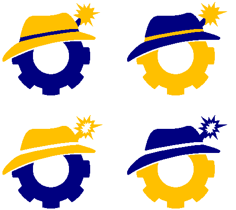
The SpyGear


The Brand: Sabotage/Espionage
Why a Fedora?
- Fedoras have a long history on the heads of classy nonconformists. Think James Bond and Indiana Jones. Plays right to our name.
- It's also the logo for Red Hat Linux (largely for the above reason), highlighting our programming element.
- It's distinctive. Just like Daisy's headbands, wearing fedoras will make us more memorable and easy to recognize.
What's that Spark?
- It keeps the spy/sabotage theme without saying "we're going to explode your robot" the way an actual bomb does.
- It's electric! The "spark of inspiration" represents the electrical element of our team.
- It accents the logo and can makes our hat stand out.
Benefits of the Brand
- Simple - single base color with simple accents, 5 shapes.
- STEM Professional - clearly a gear (with a fuse and hat); classy yet unique, not overly youthful
- Distinctive - connotes Sab-BOT-age, doesn't look like it even could belong to someone else. Memorable, easy to explain uniquely.
- Branded - embraces spy/sabotage; we can theme team-given awards, events, handouts, etc around fedoras and spies. Already ties to FLL dogtags.
- Accentuating - adds a very appropriate element to our uniform. Hatband can also have nickname/job on it. Plus we can do hat tricks!
- Customizable - can be rolled into an O in Downingtown for DAR events, made event-specific (e.g. a LEGO piece hat), or tied into an FRC game (made from a basketball, ubertube, etc).

For Media Use
- Equal length/width; doesn't necessitate any white space/text wrapping
- Can directly replace any 0 or o without confusion or more room
- Easy to work into letterhead, etc, placed in many of our words where emphasis is needed (see examples above, others available)
- Recognizable even if partially/largely obscured or covered
- Easy to scale (full detail at <1/4" square)
- Distinguishable at long distances and in silhouette
- All lines are thick and simple (and can be more so for certain applications)
- Marketing hats and mini-hats plus bracelets, earrings, buttons, lapel pins and stickers, etc in the shape
- 3 main elements (maximum 7 distinct shapes); monochrome can be laid out in 3 sections
- Major room on gear and minor room on hatband for additional information (e.g. event name and date, etc)


 Comments
 *Don't like the "swoosh" version. Non-swoosh version is cleaner & more modern.
 *Hat should be different color from gear. (Sample to right or here)
 Comments
 *Don't like the "swoosh" version, either.  I agree with the comment above.
 *Our logo should be clean, simple, and a good theme that we can carry through.  I think this one would be a good option.
 *We also need to figure out exactly what we want our theme to be ... something that is nice, classic, and still fun!
Mottos
We are currently having a run off vote between "Thinking outside the bot" and versions of 'making things possible'. Remember we're looking for something short and motivating that speaks directly to what we do and will make sense to outsiders.
- The seemingly impossible is possible. // or // Making anything possible
- NEW: Thinking outside the bot (Thinking Outside the Bot, Thinking Outside the 'Bot, Thinking outside the 'bot)
  Comments
  *"The seemingly impossible is possible" is long and awkward to say
  *"Making it possible" is too vague
Options Archive
Other Logos
Though no longer highlighted options (after the 14-Nov meeting), elements of several of these logos live on in current proposals, and they can be remixed and revised for new submissions. Note: though the "S-wrench" received the required level of support on November 14, it has since dropped out for aesthetic reasons--apparently its required height shrinks the "1640" and "_ab-BOT-age" in letterhead, etc by too much.


The Cartoon Robot


Potential renderings for smaller use with the team number:
 Comments
 *Worried about similarity to JJ Abrams
 *Too complicated
 *Looks sad/confused
 *Too young
 *Not distinctive/memorable--doesn't say "Sab-BOT-age" (could be anyone's logo)
The Triangle Möbius


- Why a Möbius?
- Alludes to Google Drive, The Verge, Microsoft Visual Studio and many other (primarily STEM) products and companies.
- Also alludes to FIRST logo.
- See benefits section.

- Benefits of the Logo
- Equal length/width; doesn't necessitate any white space or text wrapping
- Recognizable even if partially/largely obscured or covered
- Easy to scale (full detail at <1/4" square)
- Distinguishable at long distances
- All lines are thick and simple (and can be more so for certain applications)
- 3 main elements; monochrome can be laid out in 3 sections
- Marketing bracelets, earrings, buttons, lapel pins and stickers in the shape
- For Media Use
|
|
|
See full style guide here. Elements of the style guide (fonts, mottos, name style, etc) can be incorporated in other ways. Logo selection concerns only the logo itself (basically page 16 onward).
 Comments
 *Sorta bland
 *Not memorable--looks like a lot of logos
 *Doesn't "mean" anything
 *Really detailed but not our style
Other Mottos
- We Build Inspiration
- Synergy And Brainpower (SAB)
- Building Our Future [used by several small organizations but not TMed]
- A Spark of Inspiration Can Lead to a Unique Creation
- Co-Operative
- Think ahead. [used by several small organizations but not TMed]
- Honest Espionage // or // Open Espionage
- Students Achieving Brilliance
- (A different S-A-B acronym ...suggestions?)
- Current: Hope is Not an Engineering Strategy
Removed: Make. Believe. [TM by Sony]- Removed: Builders of Tomorrow [TM by LEGO, ironically]
 Comments
 *"Thinking outside the bot"
 *"A Spark of Inspiration..." is too long
Other Name Styles
Though we're not changing our name, we can change the style by which we present it. Open to suggestions:
- Sab-BOT-age [current]
- //sab.bot.age [alludes to programming/web protocols]
 "Comments"
 *I think we should stay with the same name structure
 *If we decide to change how we style it, I would suggest getting a webpage that uses it so it can link to us (and maybe have the new name website be our professional website?  Just a thought if we decide to change.